
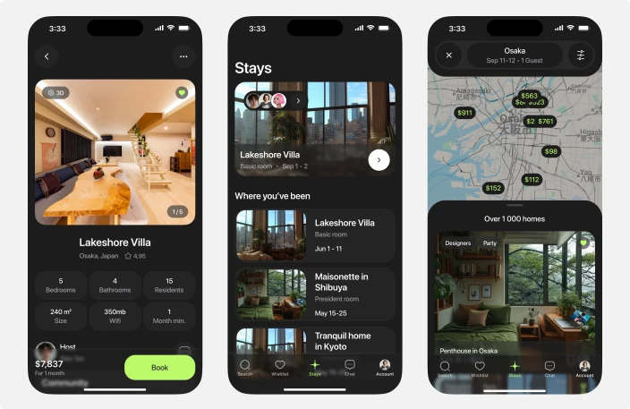
Goal
Problem
The product has no app
Coliving and Cohabs run on the web only. Robert rates his service 4 out of 10: no mobile app, poor design, hard to browse.
Rental apps sell rooms, not people
Anna gives Airbnb 7 out of 10 and still leaves. It books well and does nothing for sharing a place with people she has not met.
You cannot tell who is in the house
The same question comes back at three steps, the main screen, the house page and the house itself: who lives here and what are they into.
After the booking the product stops
Once you are in, everything shared is scattered across chats or missing: events, common zones, cleaning, the people next door.
Research
Benchmarking
- Coliving and Cohabs have no app, only a website
- Airbnb and Booking cover search, booking and payment, nothing after
- None of the four lets you see who is in the house before you pay
- Eighteen functions of fifty five exist only on our side
Competitor summary analysis
Competitor analysis
Interviews
- Know who is in the house before paying
- An app that is pleasant to look through, not a website
- A service built for shared renting, not adapted from travel
In-depth interviews
Personas
Personas
Scope
Tasks
From brief and tech spec to a clickable prototype: research, a teardown of 55 functions, flows and CJM, the app map, screens in both themes, and a design system.
What counted as done
A screen was finished when it was built from design system components, carried both themes and covered the states the flow needs.
Timeline
Brief, research, the function teardown, the app map, screens, the design system, then the prototype. Eighteen unique functions landed in the first pass.
Process
Brief and spec
CJM & User Flow
Analysis
Competitors
Structure
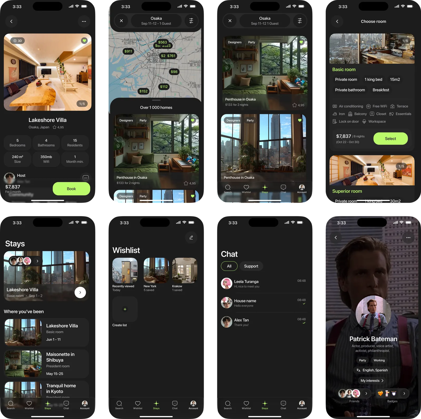
Screens
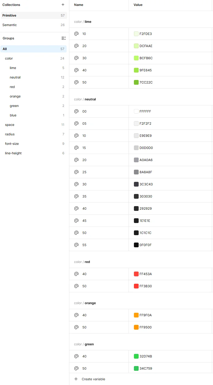
Design system
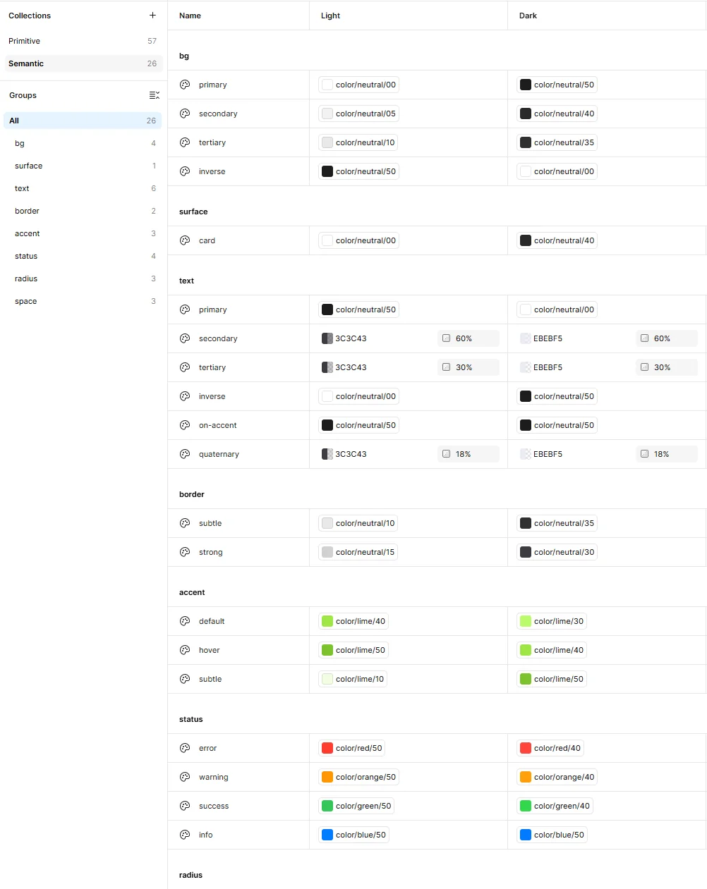
Design system
Prototype
Hypotheses
[1] Match by interests

[2] Mood of the house
[3] The house after the booking
Wanted to build
Implementation
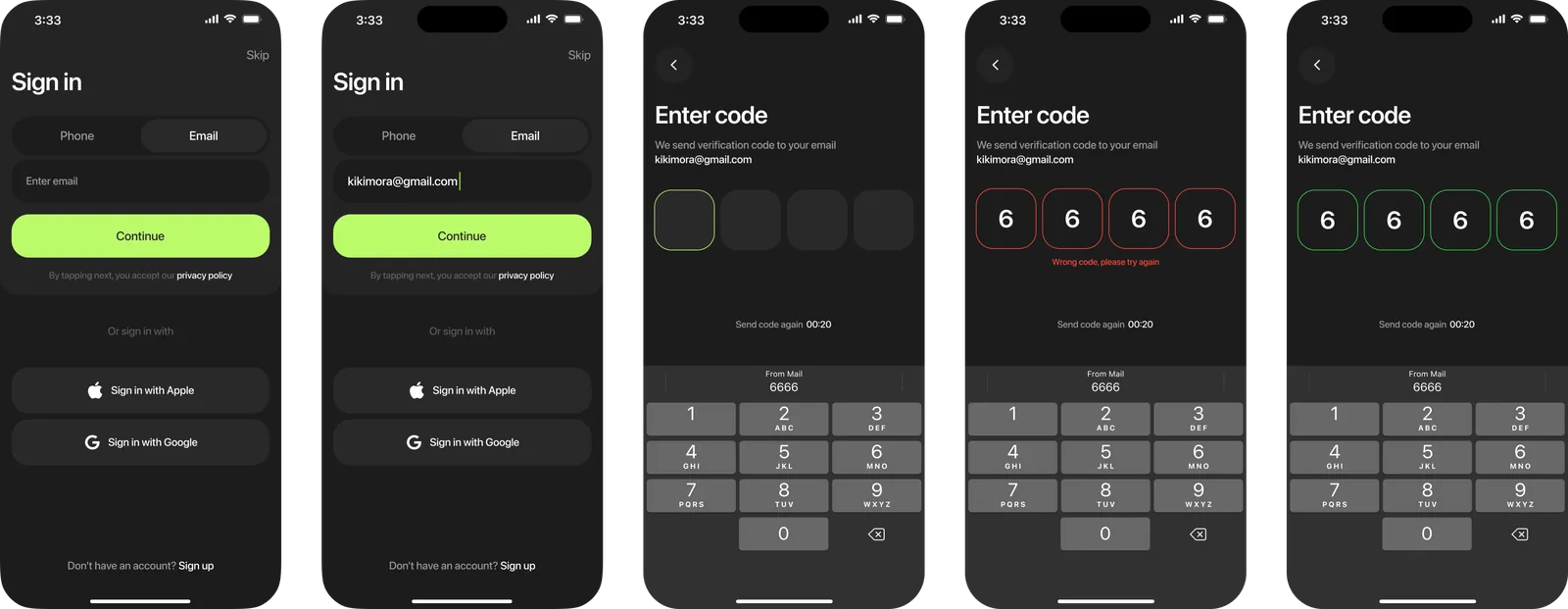
Sign-up and first entry
- Kept the flow to what people already know: a phone number or an e-mail, a code, or one tap through Google or Apple
- Made sign-up optional until payment: people open this to check prices, and a sign-up wall at that moment scares them off
- Drew the error states in, wrong code and code not received, with the support bot on the same screen
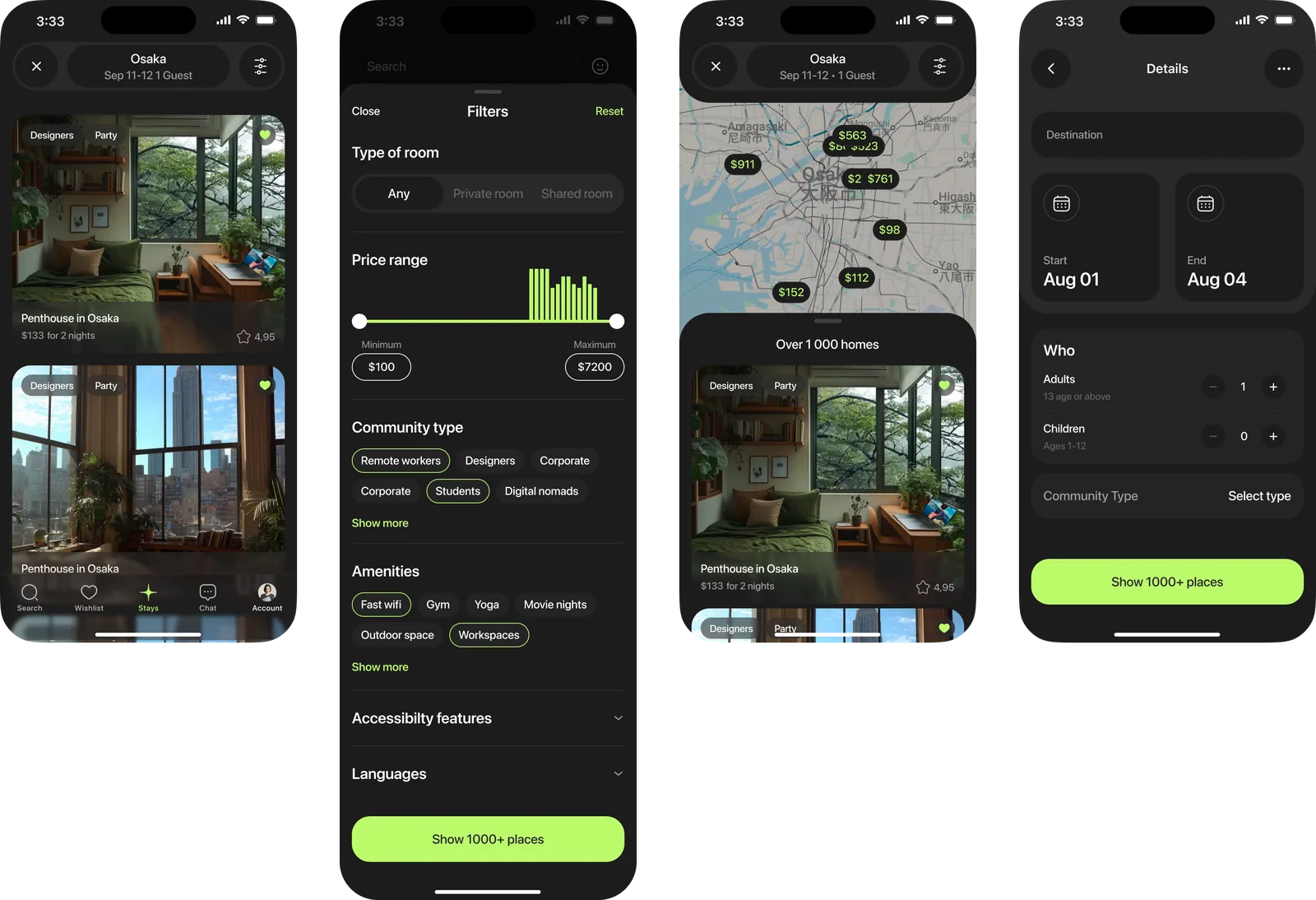
Search and the main screen
- Put search, filters and the map on one screen, because Robert named it outright: hard to look through what is available
- Added interest tags and Choose a mood as filters of their own, next to city, dates and price
- Kept the top offers in the area on the first screen, so an empty search still shows something
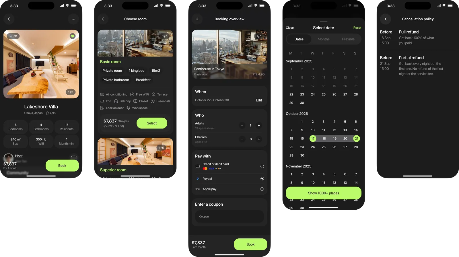
House page
- Opened with the photos and the 3D tour, then the technical details of the house: internet, shared zones, size, minimum stay
- Put the residents, their tags and the mood above the booking button, because that is what people were choosing on
- One price and one button, terms visible before the payment screen, because overpaying is the fear the journey names at booking
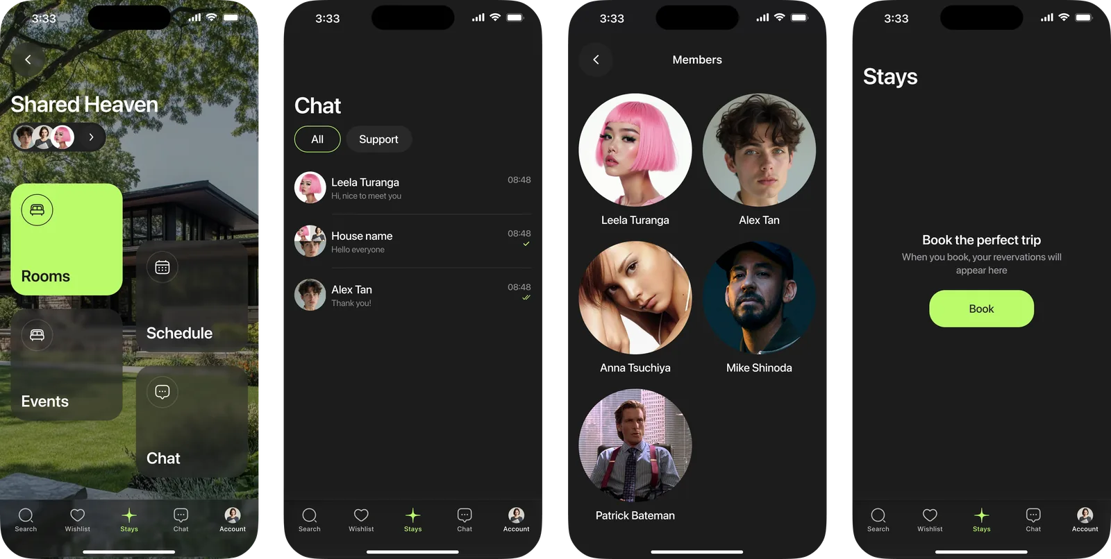
Your house
- Gave the house its own screen after the booking: health of the house, residents, events, notes and the group chat
- Put extending the stay and moving out in the same place, so the end of a rental is not a support request
- Kept the chat one tap away from all of it, since talking to the host is the most repeated action after booking
Result
Union Space went from a brief to a full product: research, teardown, flows, structure, screens in both themes, and a design system of 57 primitives, 26 semantic tokens and 61 bound components.
Eighteen of the fifty five functions exist only here: the mood and its filters, the residents sheet, the events, the health of the house, the group chat.
What I would measure
Nothing shipped, so there are no numbers. I would watch four steps: touching an interest filter, opening the residents sheet, finishing the booking, and coming back to the house chat in the first week.
Learnings
Both people I spoke to could already book a place. Neither could find people worth living with. The profile took twelve passes: I started it as account settings and it had to end up showing what a person is into.