
Goal
Problem
Too much on one screen
The first overview table carried value, APR, P&L, projected and actual earnings, range status, protocol and chain inline. CT: “It kind of loses its structure. There are just too many options displayed.”
Too little in the live product
APR needed a hover. Range status was not visible at all. Close position, withdraw fees and add liquidity were buried. Nobody could tell how a position was doing without clicking through.
The people signing are fifty plus
CT: “The clients are 50+ year olds. They might not notice something if it is too subtle. They know how to use a dropdown, they have been using computers. But they will panic if a transaction goes silent.”
The advisor had no product
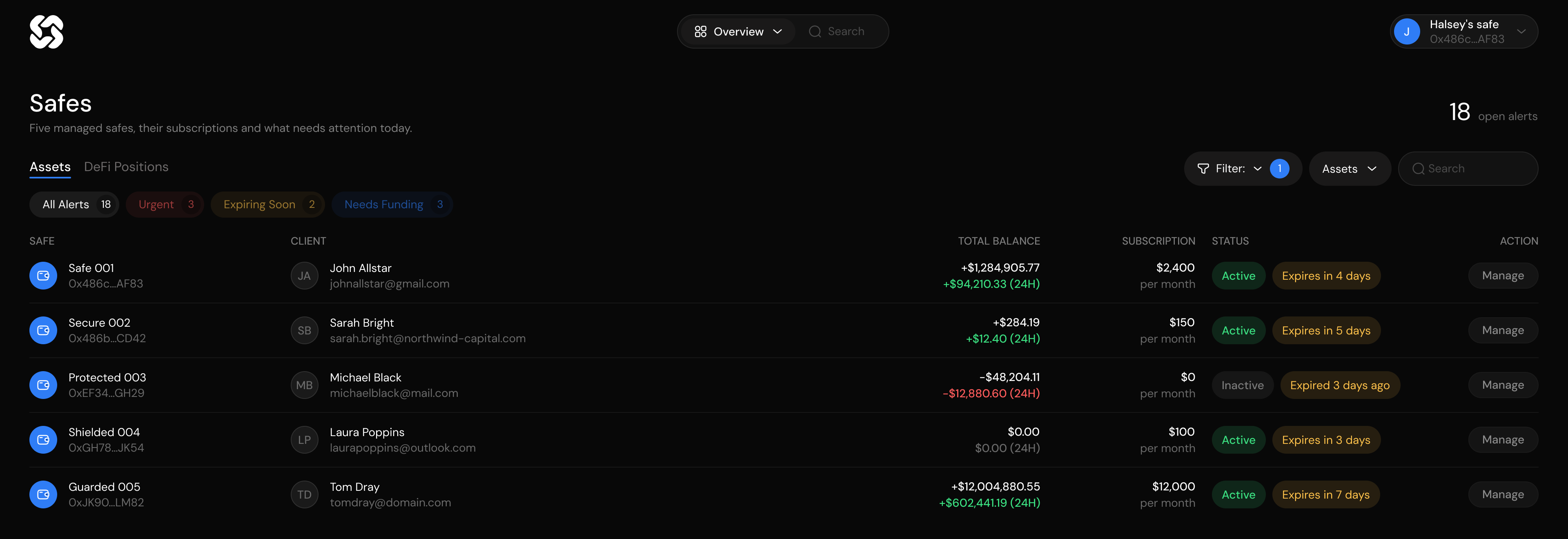
Associates manage positions for ten or more clients and want the same position applied to every Safe at a different amount. No platform was built for that, so they did all of it manually.
Research
Benchmarking
- Zapper and DeBank both show the whole portfolio, only Zapper can act on it
- The live product had the actions but hid APR and range status behind a hover
- Nothing anywhere tells you what a position will earn before you sign
- Twenty three of the forty one exist only in the new product: the advisor workflow and the minute before signing
Competitor summary analysis
Sessions
- Show the number, do not hint at it
- Never let a transaction go quiet
- An extra click for an advisor is not one click, it is thirty
Session record
Personas
Personas
Scope
Research and structure
Defined the two users, took the live product and the tools around it apart function by function, kept a record of every weekly session, and wrote both paths out before drawing a screen: owner from connect wallet to an open position, associate from one position to many client Safes.
Screens
Onboarding, overview, exploration, pool detail, configuration in three modes, the associate client list, settings with Safe permissions and roles. Each one empty, loaded, expanded, in error and in the three transaction states, which is where the twenty six plus states come from.
Design system
Components and their states in light and dark, so a new screen is assembled from the kit instead of drawn again. The connect flow covers 730 plus wallet providers, plus email, Google and phone.
Process
CJM and user flows
CJM, owner flow and associate flow
Reviewing the live product
Structure
Screens and states
Weekly sessions
Decisions
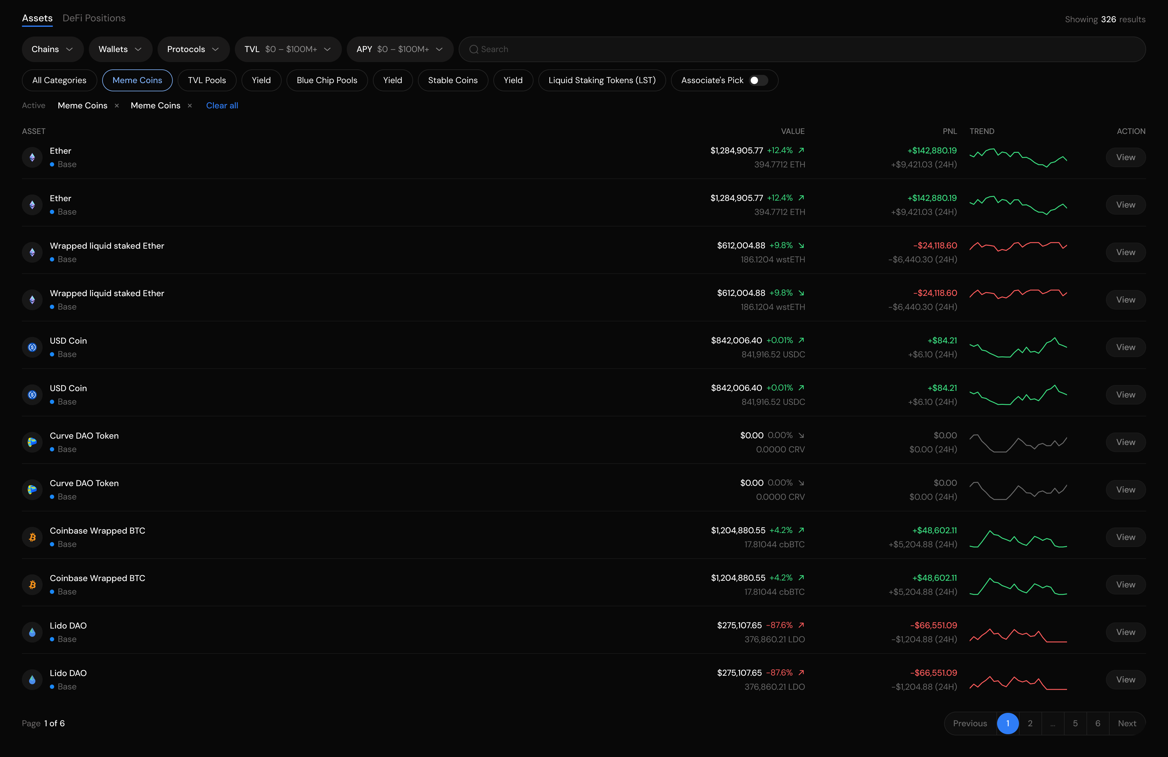
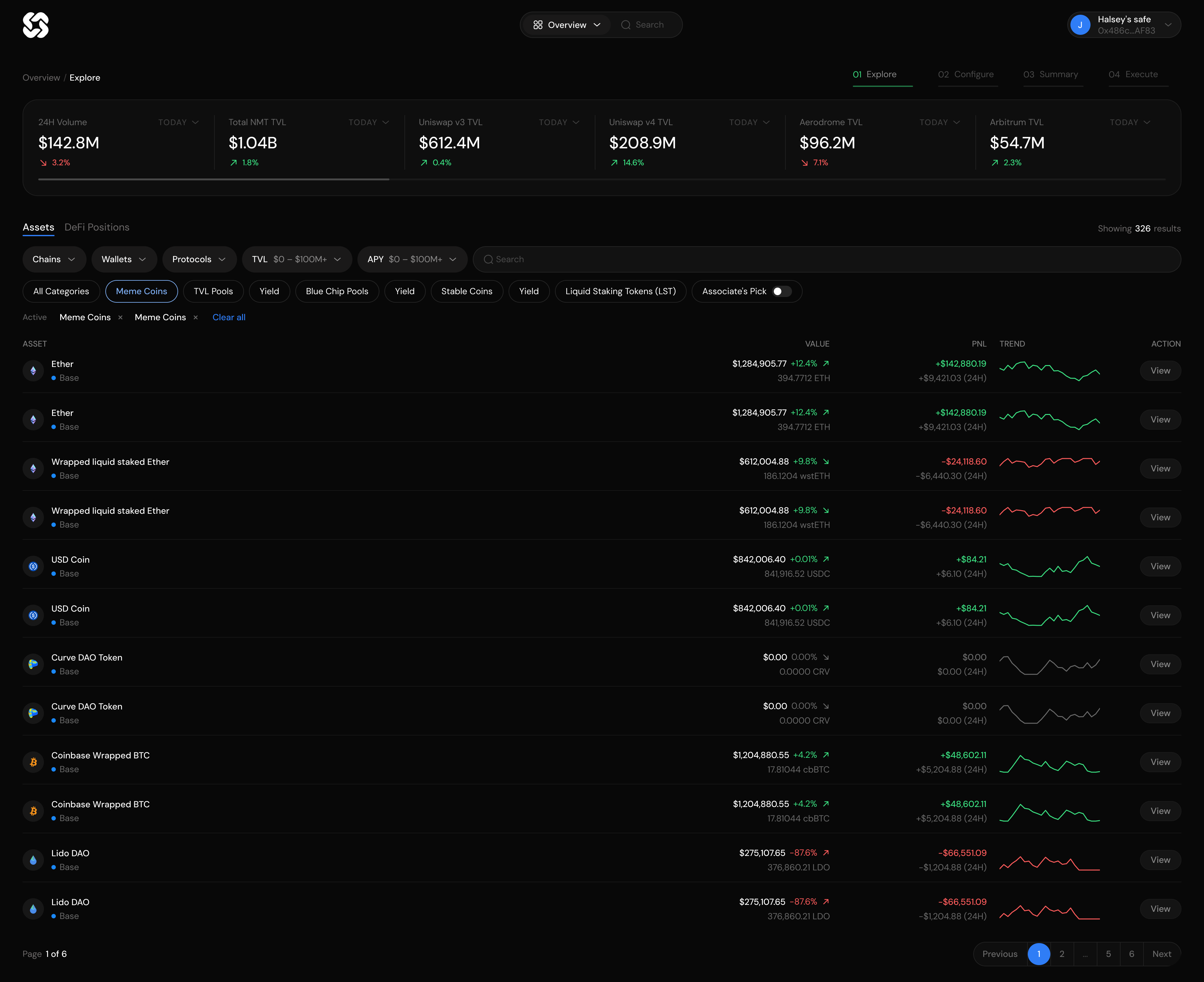
[1] The Explore page: grid, categories row and a live count
[2] The swap card: the big option won
Final design
Onboarding and overview
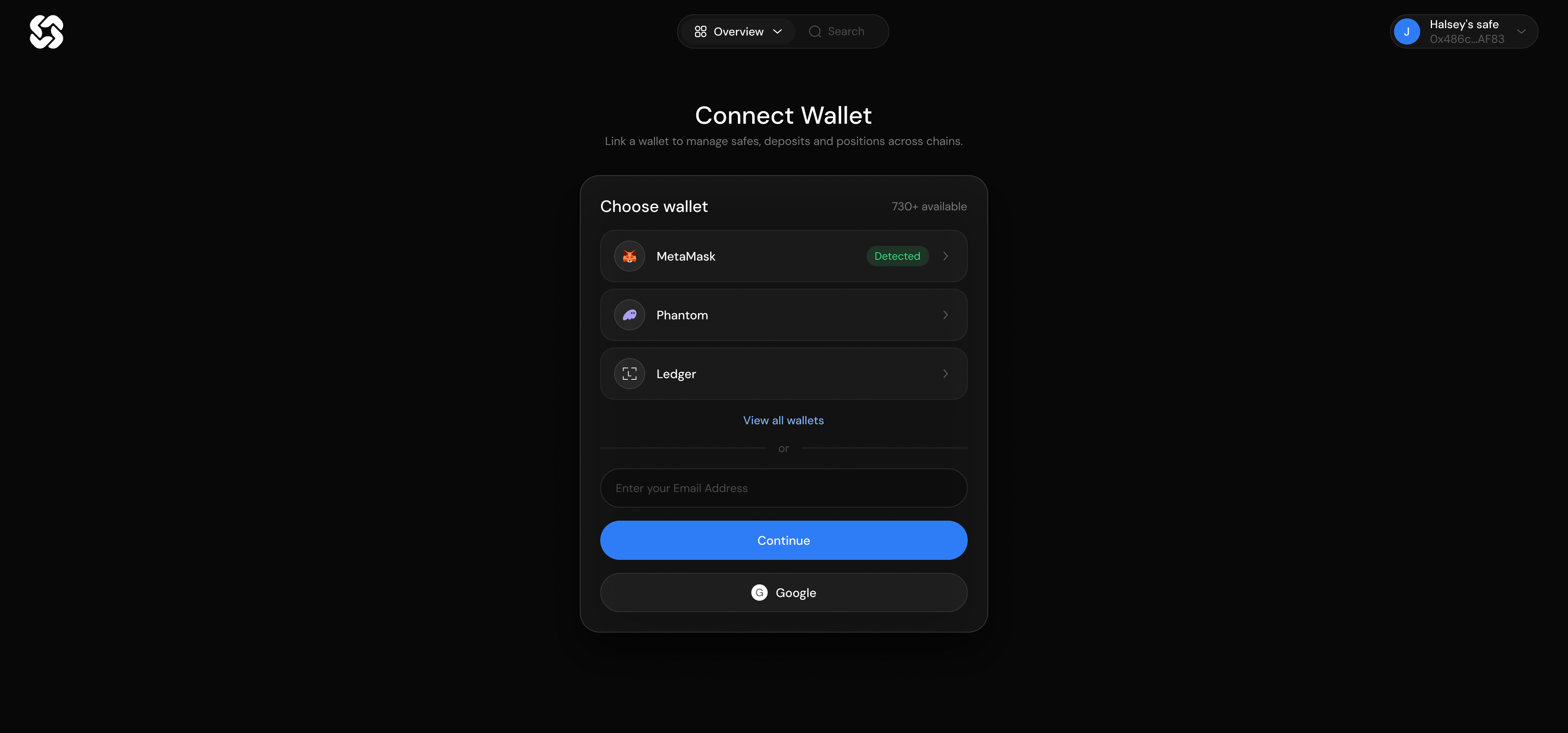
- Connect wallet with MetaMask, Phantom and Ledger surfaced, 730 plus providers behind one link, and email, Google and phone underneath
- Overview, empty state: the Safe is connected and has nothing in it, so the screen offers one action and no dead ends
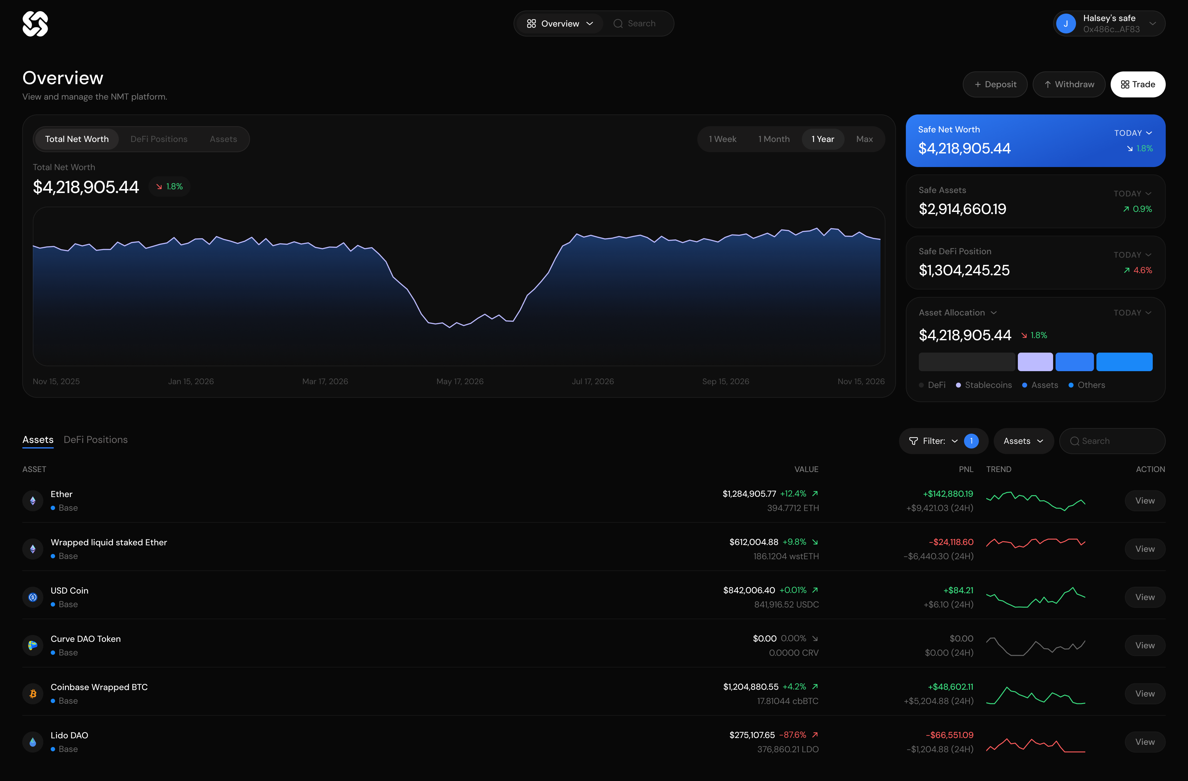
- Overview, loaded: KPI cards, allocation bar, net worth chart and the full assets table
Explore and pool detail
- Explore, DeFi positions view: stats strip, category chips, filters, grid and Showing 326 Results
- Pool page: APY chart, currency reserve, base APY, APR and the DeFi positions attached to it
- Every screen is shown in its flow, not as an isolated component
Configure position
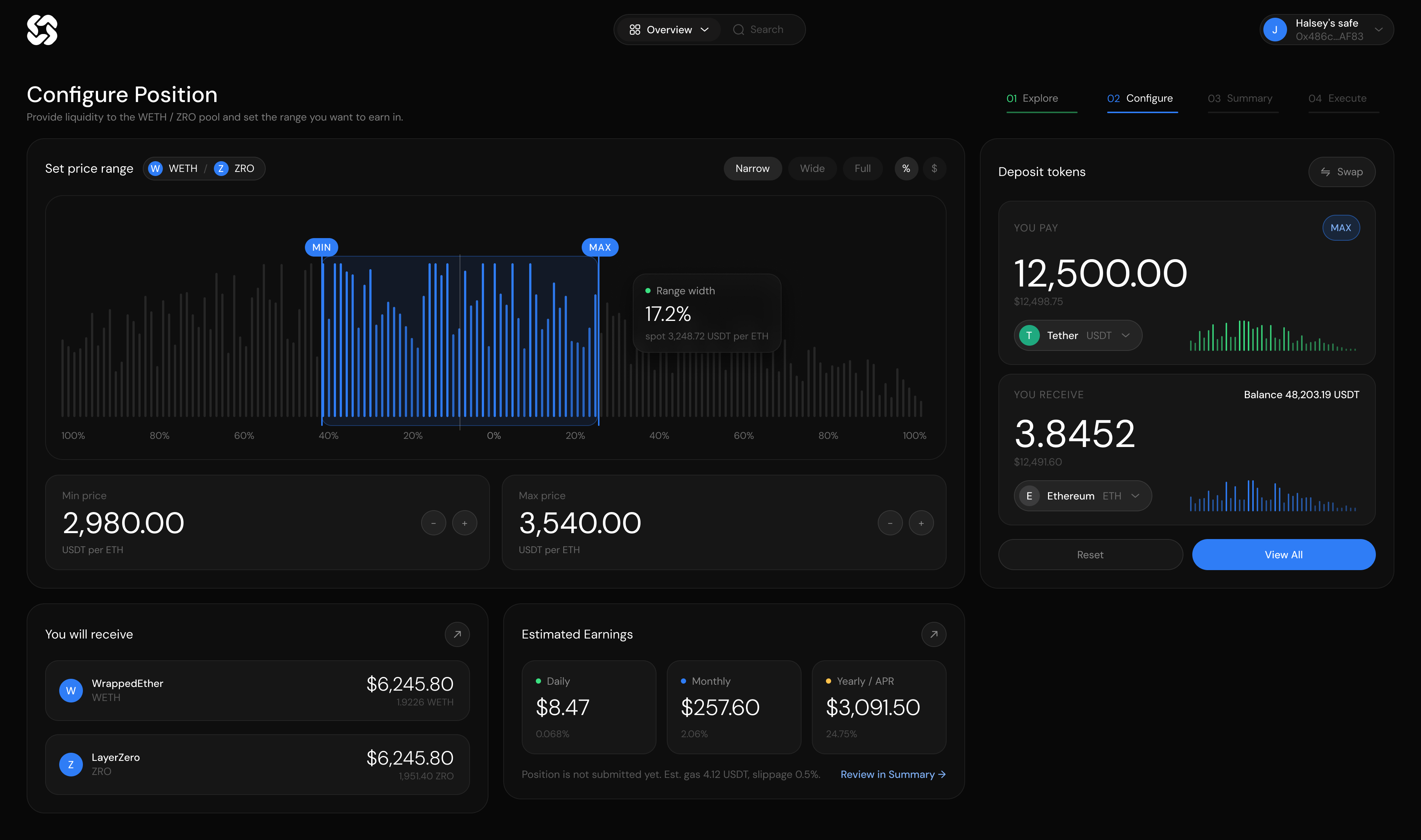
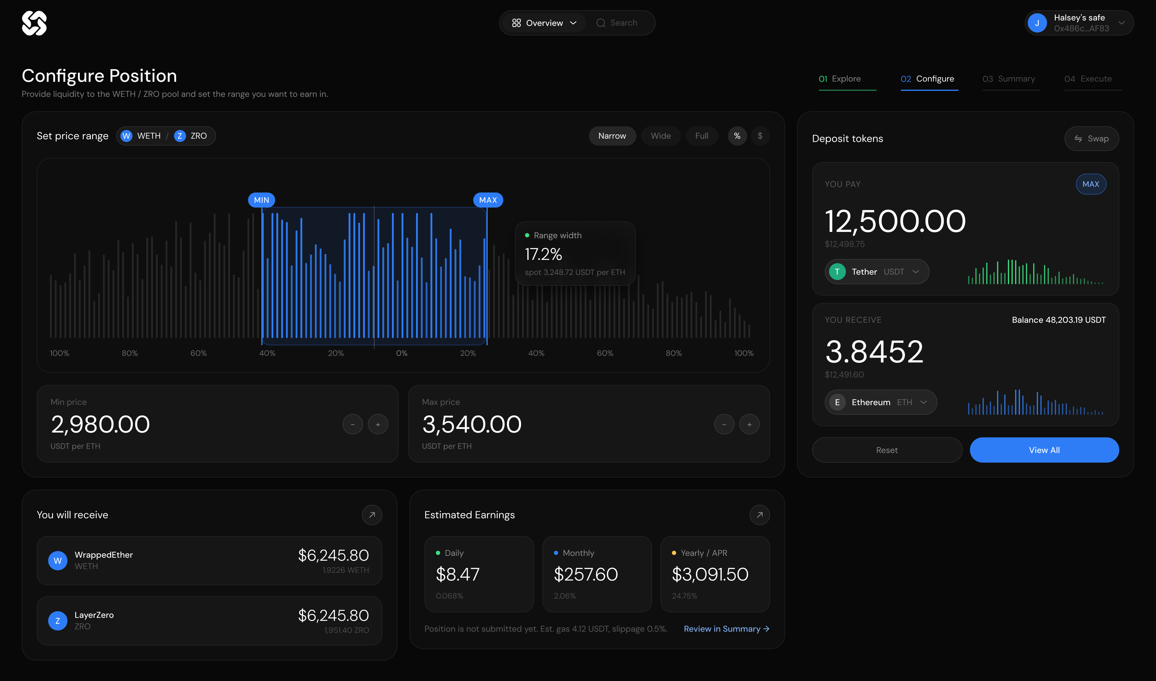
- LP mode: deposit tokens, the WETH and ZRO price range, narrow, wide and full presets, estimated earnings
- Swap mode: single token entry, live exchange rate, network fee, no price range needed
- Zap mode: one asset out of the Safe, and the price range chart owning the page
Dark mode
- Overview loaded: DeFi, stablecoin, assets and others in the allocation bar
- Open position expanded: ETH and USDC, In Range, the price range, the earnings breakdown and the three actions
- Open positions, wishlist, chat and account, all carrying the same components as the light theme
Result
NMT went from an existing product that held no one to five core flows, two user types, more than twenty six screen states, in light and dark, with every decision kept in the session record.
Twenty three of the forty one functions in the table exist only here, and all of them sit in two places: the advisor workflow and the minute before a signature.
Learnings
The most useful sessions were not the ones where CT said yes. They were the ones where he said “I keep coming back to this one weird option and I do not know if I like it because it is weird or because it is actually good.” The zap page was the hardest problem and looked like the easiest screen: the question was which element is primary, and fifteen iterations answered that it is the chart. The associate flow taught me that a power user is a different problem, not a variation, because every extra click costs them real time on every Safe they manage.